Apple’s Magic trackpad is getting more coverage and print than a simple pointing device seemingly deserves. Takethe5th sees it as a delay in game penalty for Mac OS/X. Gizmodo sees the Magic Trackpad as a precursor to the displacement and end of Mac OS/X and the emergence of a new OS4-inspired OSMac operating environ with a whole new UI-User Interface experience driven by multi-touch ; drag, swish, and drop ; other rich gestures; and context sensitive objects with flyout iconbars and menus. But Gizmodo sees a problem with this touchscreen world with monster 27″ and larger Apple screens being too fatiguing for the Cupertino devotees. Their affinity for huge screens will quickly lead to fatigue and stress as they try to manage touch screens all day long. Hence the need for a trackpad.
Takethe5th agrees and disagrees . First, a big point of agreement – for sure there is going on right now a UI “see change”[okay, a poor pun] marked by smartphones from Apple’s iPhone and Google’s Android plus the iPad phenomenon with a wave of Android and other tablets arriving this Fall. These touch-smart gadgets mark the end of the old apps with their 3-5 levels deep menubars and their cryptic rows of Mayan glyph-like toolbars. These old GUI interfaces will largely break up and become attached to the various objects and panels on the screen as context sensitive menus, flyouts and a gesture controlled UI. Instead of Image | Adjustment | Resize – pinching the object will cause a resize. For precision control graphics apps touchsmart screens may leave the property bar with precise adjustment fields available if required or a bounding crawling-ant border for touch adjustments. But the new fashion in UI is simplicity and ease of use.
However, Takethe5th disagrees with Gizmodo’s need for a trackpad solution because of large screen fatigue. First, the laptop with swivel screen and 16-22″ inch diagonal should satisfy the bulk of users who require gi-normous screens. But many consumers may defect from their desktops and laptops for the highly portable 10-14″ iPad or Tablet size. Also there are a number of alternative solutions to the trend of point and shoot UI including pen-light stylus + spoken commands, finger and mouse combos, as well as the keyboard and trackpad combo proposed by Gizmodo. In fact, Gizmodo points to a good video discussing new UI approaches:
Note that Takethe5th again disagrees with 2 critical points. Mice will not be abandoned but combined with finger operations and other direct to screen point devices while huge screens will be the creative desktop exception not the rule in computing display. Also consider the possibility of a projected display on to a nearby screen that increases and decreases in size as the user requires – zooming the whole screen yet leaving it conveniently close to the user and pointers.
Summary
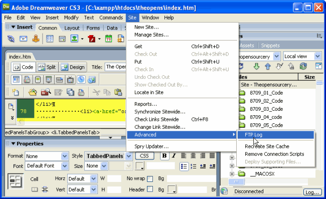
What the MagicTrackpad and the wave of smartphones plus slates and tablets indicates is a tipping point in UI-User Interfaces in computing devices. By investing in iPods, iPads, smartphones/iPhones and tablets – consumers are voting with their purchase dollars for better interfaces. than what PC desktops and laptops are providing. Thus direct touch that is fast, simple, easy to use and puts users in direct contact with panels, popups and objects on screen is the new paradigm. Making smart-device users immediately productive is the key. Helping them intuitively figure how to use a device without having to decipher dozens of icons or navigate down 3-5 level deep menus is the payoff. The new Touch UIs equal easy to learn and easy to remember how to use interfaces. No more TV-remote-control-like interfaces as seen on PC computer screens:
Note the page for edit is highlighted in yellow above.
Rather the new UI will be more accessible directly with touch and gesture, less encumbered with menus and toolbars. The new UI will also be highly context and object sensitive and thus faster to use and easier to discover/remember how to use. This is the UI Revolution being implemented on smartphones, then iPads/tablets and soon to be followed on a computer screen near you.
Two final observations. What company based in Redmond, Washington is desperately trying to catch up with this UI Revolution with iteration 5 on their 4 times missed mobile phone offerings? What major IT player in Armonk, NewYork is largely on the outside looking in and barely shaping these proceedings? Now where is the center of gravity in Computing?

