If there was any doubt before, Japan’s earthquake and tsunami removed any lingering ones and revealed the NYTimes as the world leading masters of Web interactive graphics and coverage.Our sister blog, Bookraft, has already pointed out some of the leading technologies used by the NYTimes for last year’s Winter Olympios. But covering the Japnese Earthquake and Tsunami over the past 4 days, the NYTimes has put on a virtuoso performance of interactive graphics, Flash explanaory slide shows, and outstanding mappings along with its ahead of the curve news coverage{as soon as the story broke, the NYTimes raised the issue that at least two of Japan’s many nuclear reactors were right at the edge of the earthquake and tsunami destruction zones and were showing dangerous signals of plant malfunction]. Only the Wall Street Journal comes remotely close to the quality of the coverage being provided by the NYTimes. And the WSJ has the advantage of a Japanese home base of Tokyo Nikkei reporters. The following sequence of three maps published early Friday afternoon established the quality and timeliness of the NYTimes coverage.
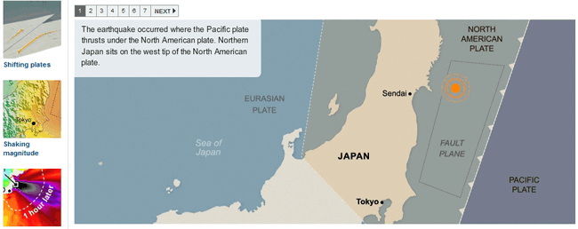
Flash Slideshow explains the geology behind the earthquake and tsunami
This slideshow in Flash shows the cause of the earthquake and Japan’s great vulnerability. Japan lies halfway on a panhandle of the North American Plate which is interacting with 3 other major plates – the huge Pacific Plate, the equally large Eurasian plate and the smaller Philippines plate. Literally Japan is right smack dab on top of 4 major plate tectonics firing lines. No wonder Godzilla as thunder lizard is the folk myth of a country that has seen some of the most devastating 7.5 or greater earthquakes in the last 100 years. The next map shows the severity of this quake.
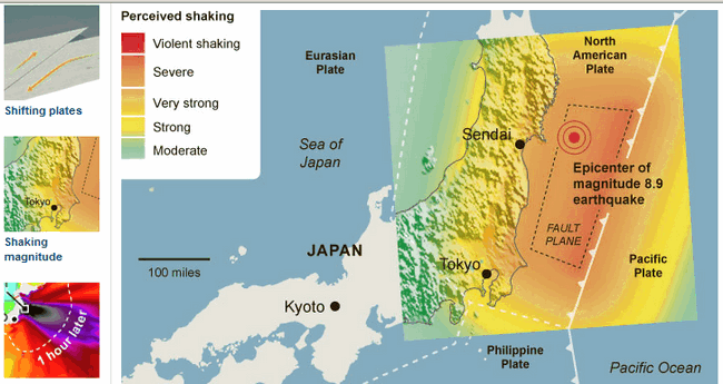
Color-coded map showing severity of quake – click on map to go to original
This color coded map shows a) how widespread the quake was stretching from Tokyo in the South over 400 mile to the Northern most point of Honshu with severe shaking and b)how severely hit were the various Japanese major towns. This map has a precedent – in the Chinese Sichuan province earthquake of 2008, the NYTimes produced a similar map of even better clarity on the magnitude and Chinese population vulnerability in the area of the quake. But this was 2 days after the event, not roughly 6 hours for all three maps and diagrams cited shown here.
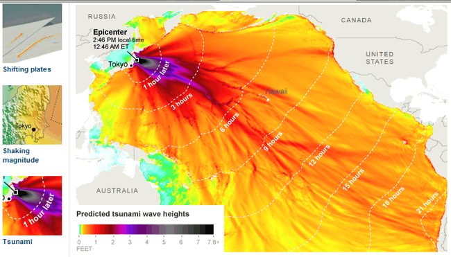
Timeline for the severity of the tsunami produced by the earthquake – click on map to go to original
This map uses iso-timelines and color coding to clearly depict the waning severity of thoe utgoing tsunami wave over time. What is remarkable about this diagram is that it appeared before the tsunami hit the US West Coast. This means resident along the coast could be alerted and know the severity of the incoming wave Also consider any naval traffic within 200 miles of Tokyo – they would be hit with a wave 7-10 feet high. See in contrast the map produced by the Telegraph in England.
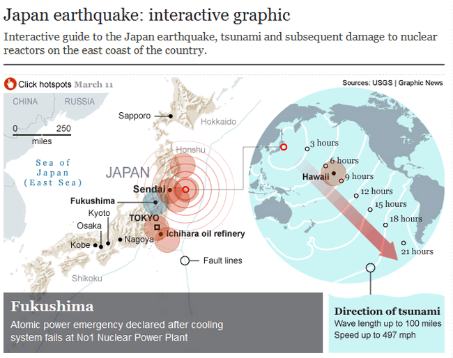
Graphic shows severity of quake and tsunami – click on graphic to go to original
This graphic combines two stories in one – a map of the severity of the quake along with one showing the severity of the tsunami. A lot of information is displayed but not nearly as clearly as the NYTimes diagrams which are all on one Web page.And more telling, this is one of the few graphics I could find on the disaster outside of the NYTimes. In general these diagrams tell the story of what happened but omit the nuclear problem and the overwhelming devastation.
The Tragedy of Overwhelming Devastation
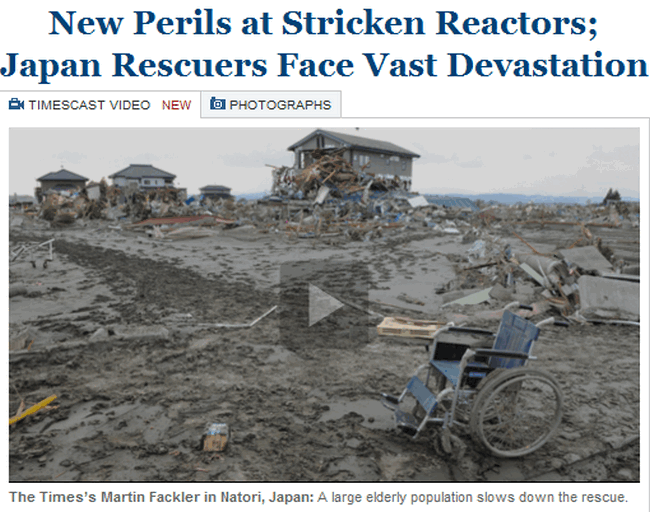
The NYTImes has a constantly changing front page story, video, and slideshow of images from the unfolding recovery but also continued nuclear crisis. The story of the disaster and faltering recovery is being told in stories and pictures changing every hour or two :
Front page videos and slideshow leads a roster of stories every day through the weekend
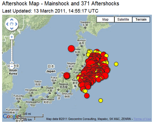
The front page stories have a recurring theme- rescue work hampered by utter devastation and consequent power shortages. Vast populations of coastal cities missing. Food, water, and power shortages throughout the northeast of Honshu where over 400 miles of country-side faced severe shocks with the initial quake. Some of the stories are heartbreaking. And lurking in the background is the nuclear plants crisis where desperate measures are being taken to avert meltdown and widespread release of radiation . And the nuclear crisis is faced with the same restrictions – no power and no water to contain the reactors. There is the historical perspective of the 1923 Kanto Japan quake – much lower on the Richter scale 7.8 versus 9.0 but in an area more populous and vulnerable. What is surprising is the frequency and severity of the aftershock – tens of almost New Zealand level quakes that the population has to endure:
A screenshot and link to USGS site mapping huge aftershocks
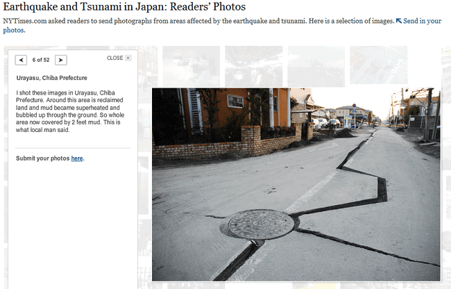
The NYTimes has invited readers from Japan to share their pictures and stories. The personality of the stories and pictures give a real feel for how people are responding in Japan now:
Slideshow of Japanese readers images and words tell personal stories – click to go to slideshow
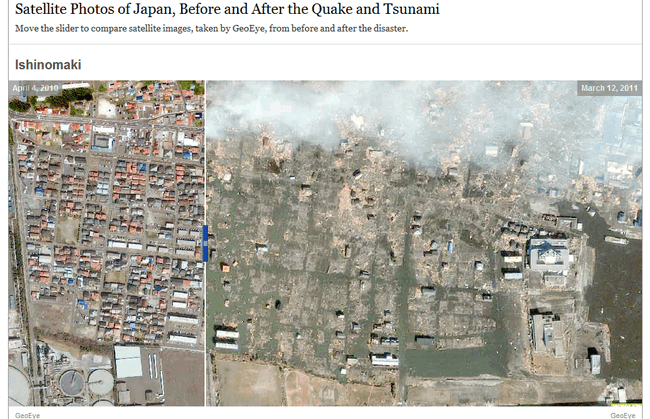
But perhaps the most telling images from the disaster is the Geoeyes Before and After images. Carefully lined up and using a thin slider one can uncover the utter destruction imposed by the combination of severe quake shaking and then the rush of 7 foot tsunami waves all along the Easter Honshu coast line. Despite the altitude, these are haunting images:
Nine images with sliders truly reveal the havoc – click on image to go to website graphics
These images and videos tell the harrowing tale of Japan’s plight. But there is a sinister lurking disaster Japanese technicians are racing to control.
Nuclear Plants: The Second Emerging Disaster
As noted before, Japan is courting another explosion and relase of radiation from 3-5 reactors located right on the coast. The problem is that at first the nuclear backup systems worked. But then the loss of power in the surrounding area, the rundown and destruction of backup batteries and powerb systems plus the lack of enough clean water forced plant operators into drastic actions.Saltwater had to be used to cool the plants which even when shut off take hours if not days to stop heating up. But the result is equipment permanently damaged by saline water super heated. All of the scientific details again were provided by NYTimes.:
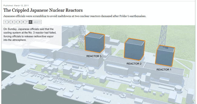
Flash Slideshow decribes layout of three reactors – click on graphic to go to original
This first slideshow describes the location and therefore vulnerability of the most exposed nuclear plant – Fukushima Daiichi. The slideshow takes users inside to see how the reactor is built with double protections in contrast to Chernobyl in the Ukraine. The key problem is the quake and then tsunami effectively wiped out the back up systems. This leads to the second diagram:
2nd Slideshow shows the specific problems within the reactor – click on graphic for original
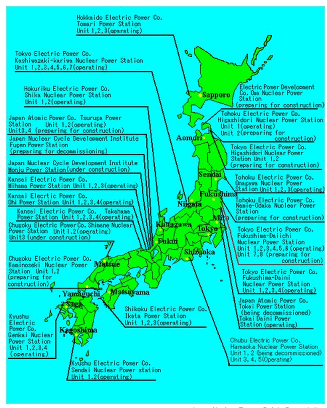
This slideshow reveals some of the specific problems encountered at the Fukushima reactors and both slideshows are very helpful in understanding the written accounts of the efforts to control the radiation hazard. As well the NYTimes has provided Science background information on the radiation sources and hazard. But perhaps the most enlightening is this map of the other major nuclear plants scattered throughout a seismically active Japan:
What Is Learned
This ongoing coverage by the NYTimes is almost a Presidential Caliber Briefing. Whats are the Teachable Lessons coming from this story ? Japan sits atop 4 very active geologic plates making the country particularly prone to earthquakes. The mechanism of destruction is worse if the earthquake occurs just offshore rather than onshore – because the quakes shaking damage is made many times worse by the surge of a huge tsunami wave [or waves depending on aftershocks and the lie of the land]. Loss of road, rail and power infrastructure hampers rescue work. Nuclear, oil, and chemical plants in the quake areas are particularly vulnerable because back up safety systems may have been destroyed or even if they survived, the power to operate them may have been cutoff. Finally, the NYTimes raises the issue that no matter how “prepared the country can be” – large scale earthquakes will take terrible tolls of lives and as well as economic and social tithings of the surviving populations.
Media Comparison and Summary
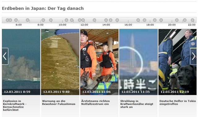
No other news orgranizations appears to come even close to the range and caliber of the NYTimes coverage of the Japanese disaster. The Wall Street Journal used a very good Google map to direct readers to the the important points of mention in their news stories. Der Speigel in Germany has a very good Timeline with image and videos staggered along it for quick navigation to the relevant story points:
Der Spiegel’s helpful timline to unfolding stories
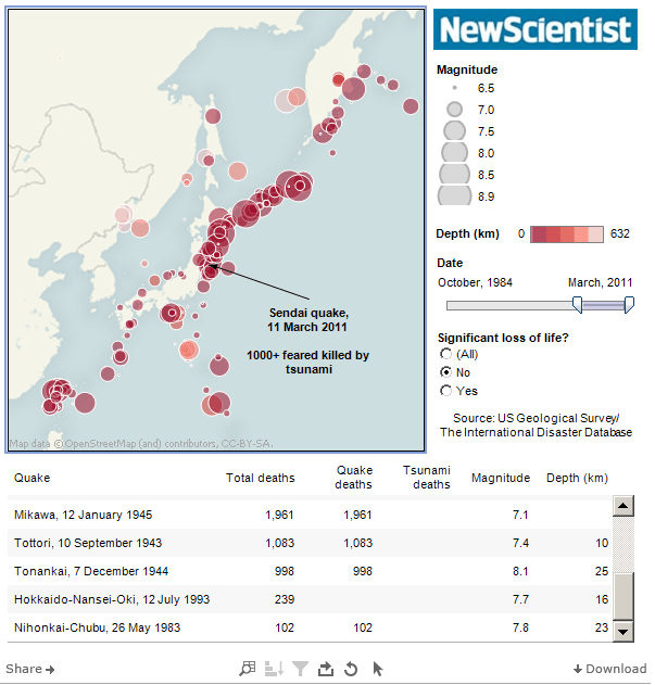
And CNN has a master page devoted to all the coverage of the event while Britain’s The Guardian and New Scientist combined to produce a history of earthquakes in Japan:
Chart and table of previous earthquakes in Japan
But the bottom line is that no other news organization matched the NYTimes for the quickness, the relevance and the insights of their coverage of the Japan Earthquake and Tsunami. Several times the NYTimes was ahead of the curve in describing events and conjecturing repercussions. Perhaps the biggest criticism for the NYTimes is that they have yet to provide a page that pulls together all the articles, videos, graphics, and stories – similar to Der Spiegels or CNN’s – a single navigation page to pull out all the richness and insights of the NYTimes coverage. But to ye Editor’s eyes this is Pulitzer Prize material and probably a good launch point when the NYTimes starts to charge partially for its Web edition again.

