
Is this the best Chart used in US Media for 2012?
What is growing in popularity on news sites like cnn.com, The Christian Science Monitor, theDailyBeast, HuffingtonPost, NYTimes, The New Republic, and Time Magazine is the frequent use of charts [or infographics] to clearly describe a situation or better illustrate some analysis. If a picture is worth a thousand words, a good chart is worth 10 times that at least. as described so effectively by Tufte’s Visual Display of Information
theWeek.com – nothing enlightening to be found
Marketwatch.com – remarkably, after the front page market charts, not much more graphically speaking
Salon.com – their attitude toward charts and graphics is succinctly summarized here
Slate.com – here is their tongue in cheek use of infographics
Taki Magazine – very few charts to be found in this conservative weekly
Remarkably, conservative magazines, which you would expect to be graphically deprived, are sometimes the very opposite. – checkout The Weekly Standard, National Review Online, and American Spectator, Of course, there are other conservative publications like Front Page Magazine that deliberately mishandle charts in a fanatical mocking tone reminiscent of the perverse methods exposed in the Merchants of Doubt
So it was pleasure to see the Best of 2012 Charts featured in both the NYTimes and theDailyBeast which showed how effective good infographics can be.. Both of these lists feature a number of simple but highly effective graphs on complex issues. Before they get lost again in the daily online deluge here are 4 of the best graphs from the best of 2012 Charts.
NYTimes Charts – Don’t Feel Sorry for the Increase in Income Taxes Levied on the Top 1%
The first NYTimes graph shows what has been happening in Median Income [the halfway point in income for all Americans adjusted for inflation].
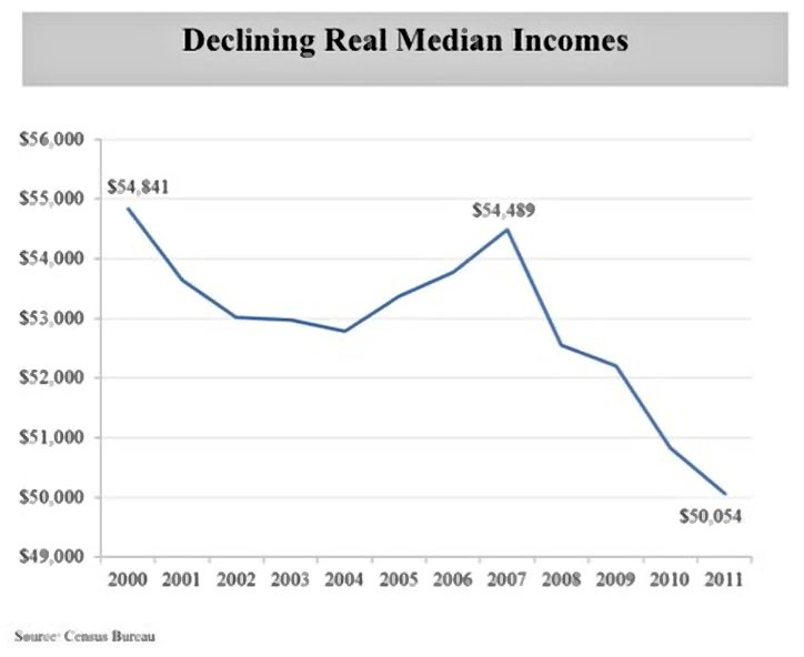
What the above graph shows is that real median family income [adjusted for inflation] has declined by nearly 9% since 2000. Even the peak of the Housing Boom in 2006-2007 did not bring up median incomes to their year 2000 levels. But this is only part of the story, because there were income gains during this period but those gains were concentrated among the top 1% of families as seen in the chart below.
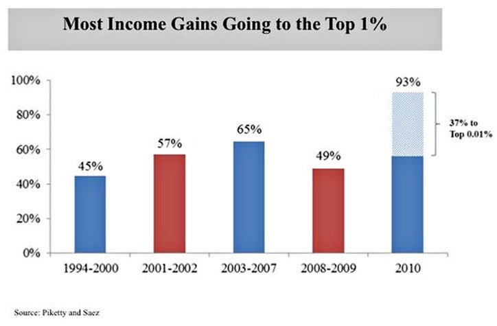
NYTimes Steven Rattner tells the tale of the income tape:
The rise in income inequality has exacerbated the decline in median incomes. In 2010, a stunning 93 percent of all income gains went to the top 1 percent of Americans. Also astonishing: just 15,000 households received 37 percent of all of those income gains. In no other period in recent American history have economic gains been concentrated so disproportionately in an elite sliver. (The red bars indicate recessions.)
Now this disparity in income earnings has been going on for over 30 years as executive pay and Superstar Compensations Systems for everybody from movie/sports heroes to financial traders. The result has seen their “Star”payscales ballooning enormously leaving fairness and risk vs reward badly askew. So shed no tears for the top 1% of US earners – they are just going back to the tax rates they paid throughout the 1990’s while their incomes in the meantime have grown by an average of 330% for the past 14 years.So in sum, these two charts show the root cause of the current prolonged recovery crisis – a pay system that take money out of the pockets of middle class earners whose consumption has traditionally driven 70% of the US Economy. Would that the GOP in the House stop defending the Wall Street and Executive elites and truly defend their Middle Class constituents interests.
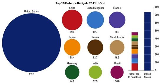
theDailyBeast – How much the USA spends on Defense
The next chart is from theDailyBeast’s list of Best Charts of 2012 featured in Andrew Sullivan’s recently departed theDailyDish. This shows the staggering amounts the US pays on Defence – 3/4 of a trillion dollars. But what is eye opening is this 9 times the amount of the next largest country, China – and is greater than sum of the Defence budgets of the next 10 countries.
Source: Mother Jones and the International Institute for Strategic Studies
By 2014 the US will have exited from Afghanistan – and so it will hopefully not be engaged in any other wars. Why then can’t substantial [15-20%] cutbacks in Defence be contemplated to be used to make badly needed infrastructure payments or to reduce the US Deficit? Well Republican President General Dwight Eisenhower warned in the late 1950s of the power of the Military Industrial Complex. Since then, by distributing major defence contracts over so many regions and Congressional districts, the Military Industrial Complex has created “don’t cut these jobs” moats against most meaningful cuts in Defence spending. Another example of the US shooting itself in the foot while BRIC and Asian Tiger countries gain ever larger economic and jobs advantages.
theDailyBeast – the relationship of Violent Crime and Single Female as Parent Families
This chart goes against the grain. It proves nothing but the current assumptions aboutthe rise of Single Parent Families as being a key breeding ground for Violent Crime in just not justified. Yet the early results show Violent Crime and the % of single parent female families as rising together closely.
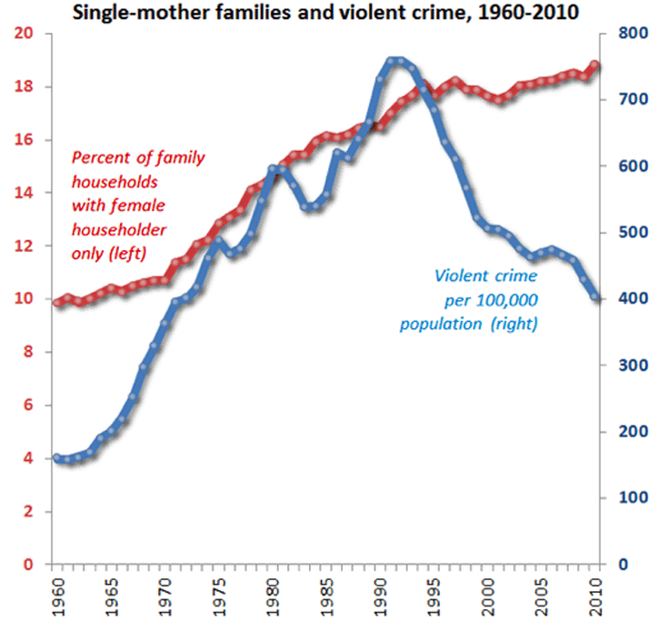
Sources: Crime data from the Bureau of Justice Statistics, family structure from the U.S. Census Bureau.
But then in the early 1990s single female parent families continued to rise but violent crime including assault, rape and suicides turned steeply downward. The reason for this change in violent crime rates has not been explained although many factors have been suggested. However, clearly single parent female families are not the sole [or likely the key] explanation. As with many imporatnt social phenomenon, one major factor explanations can easily fall short.
Summary on the Value of InfoGraphics
just like speech, infographics can be subject to perversion and manipulation. But unlike speech and reports, infographics have 3 builtin defences against manipulation. First, good info-graphics are often, like the 4 charts above, fairly simple and easy to understand. As long as the 7 Dimensions of Information are respected, it is harder to lie with charts. Second, every chart has a source. In this Internet age it is very easy to track down the source and explore the underlying data and modelling assumptions that were used to create the chart. Third, the underlying data can often be independently trackedm – so for example I know the defence spending for the UK so I can confirm one data point quickly and more if need be from my own 3rd party sources.
But the critical point is this – the need for quickly arriving at a clear understanding of domestic and international events is at a premium. Good and reliable infographics will be key to that understanding and the resulting insights. As Nate Silver [who got all 50 states electoral choices right in the Romney-Obama presidential Election] proved having good and reliable information is very valuable indeed. In contrast Karl Rove and GOP pollsters who were wrong in so many key battleground states have suffered humiliating consequences.
And finally, like Common Sense, good Infographics are easy to do. See the resources below for some how to insights.
Resources on Web Use of Infographics
Apache Open Office – do Powerpoint and media/chart presentations with ease and free software. Then export to the Web
Smashing Magazine – Data Visualization and Infographics Resources
Edward Tufte
Visual Research – develops infographics for web clients
Wolfram.com – supplies the free CDF – Computational Document File fomat powered by their Mathematica engine.