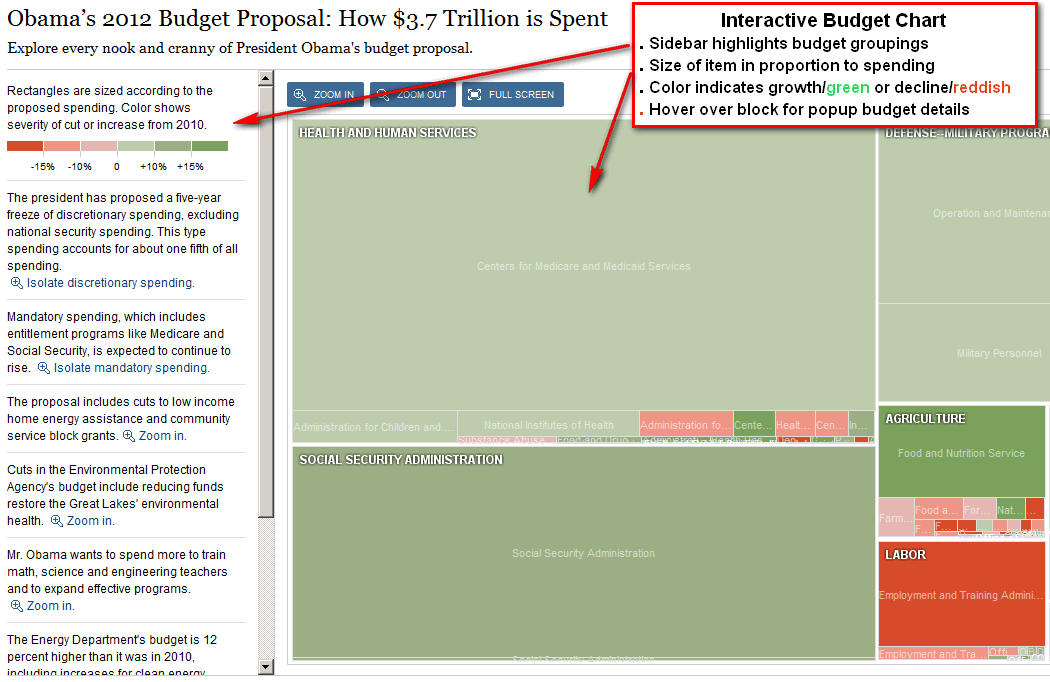
The NYTimes has done it again- produced the best online graphic of the US Budget available anywhere. And the Times did it one day after the release of the budget proposal by the White House.
This graphic tells the story of the budget in 6 ways [click on screenshot to go directly to chart] :
1)The budget is displayed in blocks by department and category with sub-blocks within each;
2)The size of the block represents its percentage of the total budget;
3)the color of a block shows growth or decline year over year;
4)Hovering over any block pops up budget details;
5)There are extensive zoom controls;
6)The sidebar activates on/off various budget groupings.
This is the fastest way to become informed about the US Budget realities. See how big the mandatory and entitlement programs are. See where the growth is.See why arguing over Foreign Aid, often the only leverage the US has in various World hotspots is only a pittance. Get a measure of discretionary spending. See how much is spent per citizen on various items. This is where the government is at spending your tax dollars – get an idea of what the federal budget looks like versus your own.

