

The following is the picture for Climate Change in Canada this past winter – December 2009 through February 2010. Note the great swaths of the the North in Canada that are seeing temperatures well above normal – as much as 7.5 degrees Celsius. Now context is everything because what is not shown is the temperatures in the US over the same period where they have been cooler than normal as the JetStream has dipped much lower than before allowing relatively cool Arctic air to slip ever farther South. Here is the map of the USA for February 2010 from the US Weather Service:
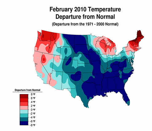
So the context shows two things. First, the extreme variability of the weather in North America with large portions of Canada and the US subject +8 degrees F and also -8 degrees F in temperature [but primarily in the US]. Second, that examining weather numbers and trends with reference to a)the big picture and b)the underlying weather models and patterns for an area and how they are changing is critical to understanding long term trends in the weather.
2 thoughts on “Global Climate Change: Canadian Picture”
Leave a Comment
You must be logged in to post a comment.
This is not an example of global warming. This is an example of what happens when a negative EPO, negative AO, and negative NAO pattern combine in the winter. It leads to high latitude blocking and forces lower heights into the United States, thus the temperatures you are observing. The blocking was caused by strong warming in the stratosphere, which is connected to the west based El Nino and high mountain torque over Asia. This type of pattern was also seen in the early 1960’s, mid 1930’s, and it is hypothesized in the late 1890’s, although we obviously don’t have upper level date from that period.
I would be careful about making these assumptions that this winter was caused by Global Warming, when other factors had clearly more influence.
Steven –
I have written a complete posting here on why I think the weatherman’s point of view on global warming is often flawed:
1)Its way too narrow in scope looking at small regions and not the big picture;
2)Its also too narrow a view in time – cherry picking one date versus another where as good studies use a smoothed average for the base time period often of decades to compare with a target year or three;
3)Its too particular. Climatologist have only worked out the basic models on why global warming is occurring; they are looking for more detailed models to explain some of the polar and other regional specific observations that can be seen as below:
Weathermen are often not looking to work with the solar interaction model that underlies most climatology studies. This is not to say that weather mechanisms do not effect Global Warming – clearly they do; it how they interact with the more global solar enrgy flux that is currently the subject of the most productive insights on weather. Like Handy’s frogs that get boiled to death by slow, small incremental temperature increases – humanity has to be more serious about the controlling the impact of global warming.