Ye Editor has always wondered who does a good chart of the global weather patterns? Okay, not all the wind patterns, barometer readings, humidity – it is the temperature that is of interest. Yes, on a crude scale – tell me if the weather has been trending hotter over the world in the last few years. As It turns out , the “who” is NASA. Yes, this is a hot topic, subject to much heated debate – but the whole idea is to see if all the weather records of the past 100 or so years shows things getting warmer, colder or no net change. Well , ye editor happened upon this:
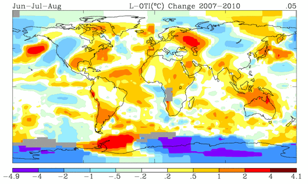
Global map of Summer Temperatures 2007-2010{click on map for original]
Here is last 3 summers weather patterns, at least in temperature. And sure enough, there is Western Russia and the Ukraine suffering a 4C increase in temperatures that wiped out the summer wheat and grain crops. And the continuing drought over Australia as marked by continuing high temperatures[but the sudden reversal of rain and cyclone Yasi in Northeast Australia is totally opaque to this map]. See also the warmth hanging over the Eastern Pacific stretching from Hawaii[friends on a cruise trip through the area can and did tell the whole baking hot story one too many times]. But also note the overall pattern, what Steven the Weatherman would call the net average for the whole earth. There are as many cool spots as warm – a net zero and hence No Global Warming!
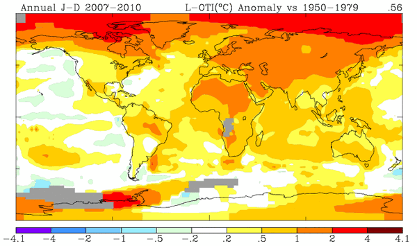
But lets take the same period, 2007-2010, and compare the temperature changes to an average temperatures over a base period of thirty years[1950-1979]
Global Map of temperature Change :Average 2007-2010 vs Average 1950-1979
[Click on map to get full results]
This map show the full story. There can be a lot less doubt about the warming trend. The base period is long, 30 years, so no “cherry picking” of the best possible case for global warming. Likewise, the target of recent temperatures are averaged over 3 years, again lowering the effects of chance/erratic observations. And thus you have the real picture of global warming. Note that many of the more populous areas of the World have seen the least warming while Saharan Africa, Eastern Russia and the Polar regions[hence the great shrinking of Arctic ice cap and the calfing of huge country-sized icebergs from Antartica have occurred here]. The stealth in Global Warming trends is the heating maximums in the highly less populated far North/South Polar regions. Click on the map directly above to see the complete NASA data compilation and the map of Latitude increases.
So here you have a concise summary of Global Warming courtesy of NASA. [They do this because NASA is also doing planetary maps of temperatures for the Moon, Mars, Venus, etc.]. So if you meet any Global Warming doubters, send them here and ask them to forecast the global weather trends for the next year or so.


