Bitter facts are very hard to swallow. A colleague committed to company and work gets laid-off by that company depite warnings. A close relative gets a medical death warrant of short duration. An artist friend sees 2 years of work eviscerated in an unexpectedly caustic review. But these are all personal events and judgments. Broader political or social facts are a)hard to establish as being close to reality and true and b)accepted for their implications. Take Global Warming. Because its big, diverse, and slowly accumulating in its consequences – there has been a great deal of denial of even the basic warming trends. And the emergence of China and the disappearance of domestic manufacturing jobs leaves the US and most of the rest of the World in the quandary of how long do they want to finance the rest of the Chinese 750 million out of poverty? Given the upheavals in Arab countries, that period is not long.
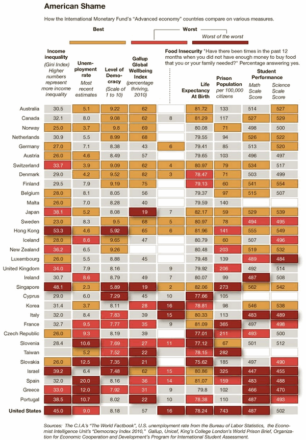
So when the NYTimes published its Empire at the End of Decadence Map of Shame, all sorts of red flags went off.
First and foremost this is a very bitter pill to swallow, the USA being the Worst of the Worst in so many important economic and social categories. So first, the data better be right and easily checked[sources provided but no convenient link to the relevant articles and/or data]. Second the chosen data and their measures should be well explained[big lapse on both criteria, really inexcusable]. Third ,a brief discussion of each criteria and how other measures such as growth in income disparity or very recent scholastic tests lend back up and credence to the various measures chosen[again no effort here and so disappointing]. So ye Editor wont argue with the bitter pill’s conclusions but will strenuously object to their lack of back-up support and background explanation.
One does not often get a chance to present a dismal case well,. So, though the table above has close to the usual high NYTimes charting excellence[let me quibble with gold as the Best color – green is more distinctively different], the support and explanation for the arguments are really lacking. Let me give a real world example. Takethe5th has this map of the Israeli settlements in Palestinian West Bank territory. My Israeli friends shrug and say they are fighting for their existence. My Jewish friends say the data and map are wrong and the Arabs have sold out their properties. Ye Editor knows that what is necessary is a series of maps of the Palestine region from 0.0 AD through major changes including 1900, 1929, 1946, 1947,1964, 1967, etc showing the Arab versus Jewish populations and territorial claims. Unfortunately access to time and materials translates into the simple fact that this background story has not been done. So ye Editor admits getting to a palatable bitter pill is not easy; but I suspect the NYTimes has more resources to make their bitter pill at least unquestionable.

